I’m under a bit of a hammer today, so: SPACE MAPS.
Now, I don’t have a good way to display the full scope of the 100-light year radius of space that I’ve defined. If I make it small enough to fit on a screen, it’s to dense to read properly. I’ve made some attempts at combining screenshots, which I’ve found… unsatisfying. Partly because it’s showing 3-D space on a 2-D screen. The actual ChView program lets you turn the view on all three axes, so while one can’t create a static image that gives a proper sense of the stellar geography, you can move around and get a sense of distance and connections.
But this is still a work in progress.
Map 1: Centered on Terra (Earth), with a 25 light-year view radius. (Of course, since the screen is wide, we don’t see the full 25 light-years to the top and bottom.) The white circles with blue trim are homeworlds: Terra, of course, as well as Starkasia, Caraw, Lestri, Krek’ixa and so forth. The gray circles are colonies: all six human colonies can be seen: Centaurs and Europa Nueva (though their labels overlap, since they are part of the Alpha Centauri binary star system), New Canada, Cygnus 1, Indus and Reijani. Their are also 15 Terran Fleet Bases (the various TFB’s). In the right corners the edges of Surani and Nirizhi space are visible. But this is somewhat misleading: One would think that TFB-Bravo and Delta are the closest to Reijani. In fact, neither are: TFB-Oscar is the closest.
MAP 2: The same map, with route markers turned on for some sense of scale. Blue lines means less than 8 light years distance. Yellow, less than 6, and green less than 4. But this is also pretty confusing. Let’s spin the image.
MAP 3: From this angle, we get a very different sense of the geography. We can see how Reijani and TFB-Oscar are in roughly the same direction from Terra now, for one. We no longer see Surani or Nirizhi space, but Paxin space dominates the right side of the screen. And the top left shows a few outlying territories of the Triumverate (the strange symbols– how ChView renders the Greek Letter “Ψ”).
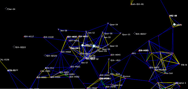
MAP 4: Finally, a different part of space, centered on Quro and Senilac, homeworlds of the Quuos and the Senicala, two species that have been at war with each other for decades. This is about 40 light-years from Earth, and the scale is slightly larger– about 30-ly radius. Some Terran space is visible in the bottom right corner. The bottom and bottom left is dominated by Triumverate Space, as well as Calitras Terriories. And up by the top, we see the very edge of Zuthekan space. Zuth-Ω-81 (another bad rendering of Greek letters…) is only 19 ly from Quro. That was actually a bit of a surprise to me: I didn’t think the Zuthekans came that close to Quro, or Nirizhan space for that matter. A happy discovery. (Happy for me, the writer, since it’s ripe with potential. Less so for any Quuosians or Nirizhi who may have to deal with Zuthekans.)
This ended up being more than I intended to write– it was just supposed to be, “Here, look at some maps.” But, frankly, once I started checking them out myself, I kind of geek out on my own work. Silly, no? But that’s how it works.


This is some really cool shit.
Pop me an email about this world at some point,
I don’t make a habit out of commenting on old posts, but I’m incredibly intrigued by your use of ChView and couldn’t think of anywhere else to mention this.
I too am trying to make sense of the corner of space my Space Opera setting occupies. Currently I’m stuck in 2D paint mode. It’s function enough for my purposes (I’m less of a worldbuilder than you), but it doesn’t really work you know?
Hit me up with a message, as I’d love to hear more about your method. Like.. how to wrangle the program into working for a layman like me, “simple” randomization, etc.
Converting my current maps into something closer to your format would help quite a lot!
JC- I wrote to the email listed on your wordpress page. Let me know if you didn’t receive it.